Below is an image of the front cover of the digipak that we originally had in mind (without the image of the artist). After creating the front cover on Adobe Photoshop CS3, we asked our teacher and a couple of our friends for feedback on the use of colours, effects and text. In response, we were told that the colour purple didn't look too good for the digipak and that the purple almost made it look like an advertisement for a Cadbury's chocolate bar, which we somewhat agreed with. We were also told that the font looked a little bland and old fashioned, and was advised to change it to something which looked more modern and bold. In terms of the effects used, we were told that the addition of the smoke was very effective as it linked in with the whole theme of the album.
 |
| Previous Idea For Front Cover Of Digipak. |
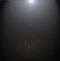
Taking all of the advice that was given to us onboard, we decided to make a few simple changes to our digipak including the colour and the text. Below, you can see the processes of producing and developing our digipak.
 |
| After Changing The Background Colour And Adding Both The Lighting Effect And The Flare Lens Effect. |
 |
| After Adding The Smoke Effect. |
 |
| After Adding The Album Name In A More Modern Font With A Ghost Like Effect. |
 |
| After Adding 'Conquest Presents' To The Front Cover Of The Digipak. |
Below is an image of what the final front cover for our digipak will look like. The front cover of the digipak will be completed when we incorporate an image of our actor. As you can see, we have listened to the feedback that we had received and we have developed on our previous idea. We decided to lose the purple and make the background for our digipak black. We added a lighting effect onto the black background to make sections of the digipak lighter, giving it a greyish appearance. We also added a flare lens effect to the front cover of our digipak for additional lighting. The primary reason for adding the flare lens effect was so that when we incorporate the image of the actor, the light shining down on the her helps to draw attention to her. It also adds to her star persona making her seem innocent and pure at heart. We also changed the text to a more modern looking one and we spaced the text out. We also added an effect to the text to give it a 'ghost like' appearance. The text fades out vertically from top to bottom. We felt that this would help to make our digipak look more visually exciting for the target audience.
 |
| Final Draft Of The Front Cover Of The Digipak Without An Image Of The Actor. |
0 comments:
Post a Comment