CLICK HERE FOR BLOGGER TEMPLATES AND MYSPACE LAYOUTS »

Thursday 15 December 2011

Production Of Music Video


Monday 12 December 2011

New Actor For Our Music Video (FINAL)

Weekly Log 8/12/11 - 15/12/11

This week, we are aiming to finish filming and editing for our rough edit which is due in on Thursday. We have tried to stick to the schedule as thoroughly as possible to ensure that we would film all our footage in time for our deadline. However on the Sunday, we were unable to film because the actor which we had previously arranged to film with dropped out due to dedications to her own work. Luckily, on the Monday, we managed to find a more appropriate actor who is easily accessible and lives local so we could film for longer durations. We arranged to meet up on the same Monday after school and go to Southbank to film some test shots to see what the footage would look like when filming in the dark. This didn't go down to well as our actors face was too dark when filming so we couldn't see her facial expressions very well when it came to miming the lyrics. We showed our teacher the footage and was told that it was too dark and that we should film during the day when its light. Me and Kadeem sat down with our actor and discussed when each of us were free to work out when would be the best time to film. Our actor was free to film after school on the Tuesday and in the morning from 8:00 - 10:30. On the Tuesday...

Wednesday 7 December 2011

December Schedule

Below is a schedule for our media coursework to help us stay on top of our work. We created this on Microsoft Word by creating a 6x7 table and filling in the dates. This will enable us to keep organised and will tell us what we will be doing and when. This schedule was primarily created so that we could prioritise our time efficiently to meet our rough edit deadline. 

New Actor For Music Video

Unfortunately, both our actor and our back up actor that we had previously arranged to meet up with to film our music video have dropped out and are now telling us that they can not participate in our music video because they have other coursework that they need to commit to.

Image of the new female actor for our music video.
 Above is an image of our friend who has volunteered to act in our music video as our artist. We have already arranged to meet up on Sunday at Southbank where we will begin to shoot some real footage for the rough edit for our music video.

Monday 5 December 2011

Recee Shots And Location Footage


Below is an image of the main walkway at Southbank. This will be where we will shoot the footage of the artist/actor walking down and singing. This is a good location to shoot because it is quiet during the day whilst most people are out or at work so we won't be getting in anybodies way or no one will get in our way. The advantage of using this location is that if it's dark or light and were shooting and the lighting is natural and high key, we are already provided with lighting, where as if we are shooting and it is dark, we are still provided with the street lamps and other lights around us. If it is dark we could also bring lighting like torches or lights which use batteries. Another advantage is that if we find this area to be quiet busy, we can always walk down and use another section of the South bank as the pathway is very long.

Walkway at Southbank.

Walkway at Southbank (Other side).


Walkway from above.
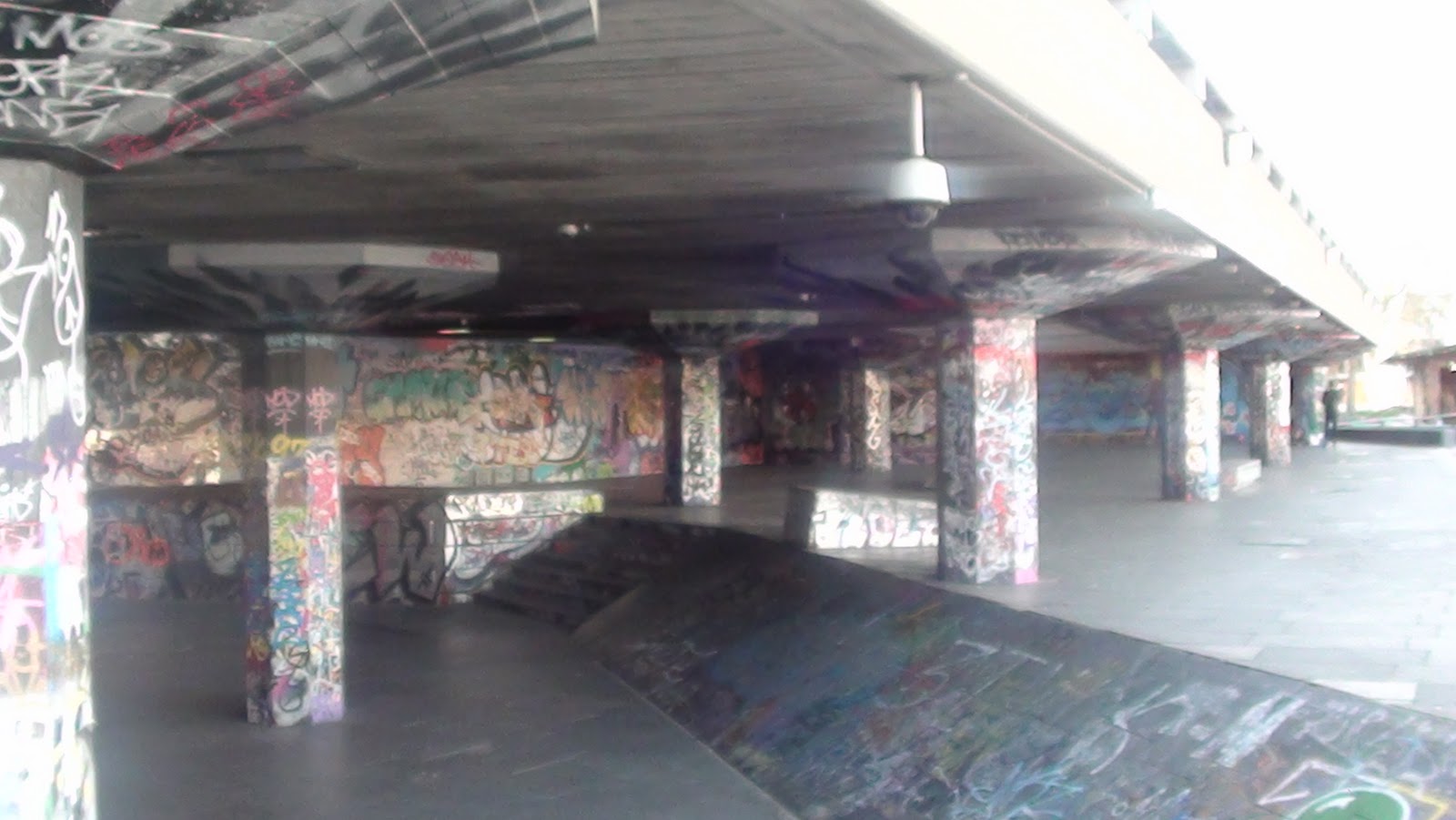
Below is an image of the skatepark at Southbank. We may consider filming at this location because it is an area which is popular amongst a lot of young people and they may be familiar with it. A disadvantage of using this location is that if it gets dark, its going to be hard to film because it would literally be pitch black in the skatepark due to a lack of lighting.

Skatepark at Southbank.
Below is an image of a bridge near Southbank. This is where we will shoot some footage of the artist/actor singing along the bridge. The reason we chose this location is because the view from the top of the bridge looks appealing and the car and street lights along the bridge would also look effective in the scene and would provide additional light if it is too dark whilst filming. A disadvantage of outside locations is that we are shooting in a season where it becomes dark at early times. The sky will also appear to be dull and grey as well which could possibly ruin the visibility and vibrancy of the music video. Therefore, when it comes to editing we may need to use tints to create brighter effect, possibly change the contrast or bring torches and lights which use batteries.

View along the bridge.
View from the top of the bridge.

View along the other side of the bridge.

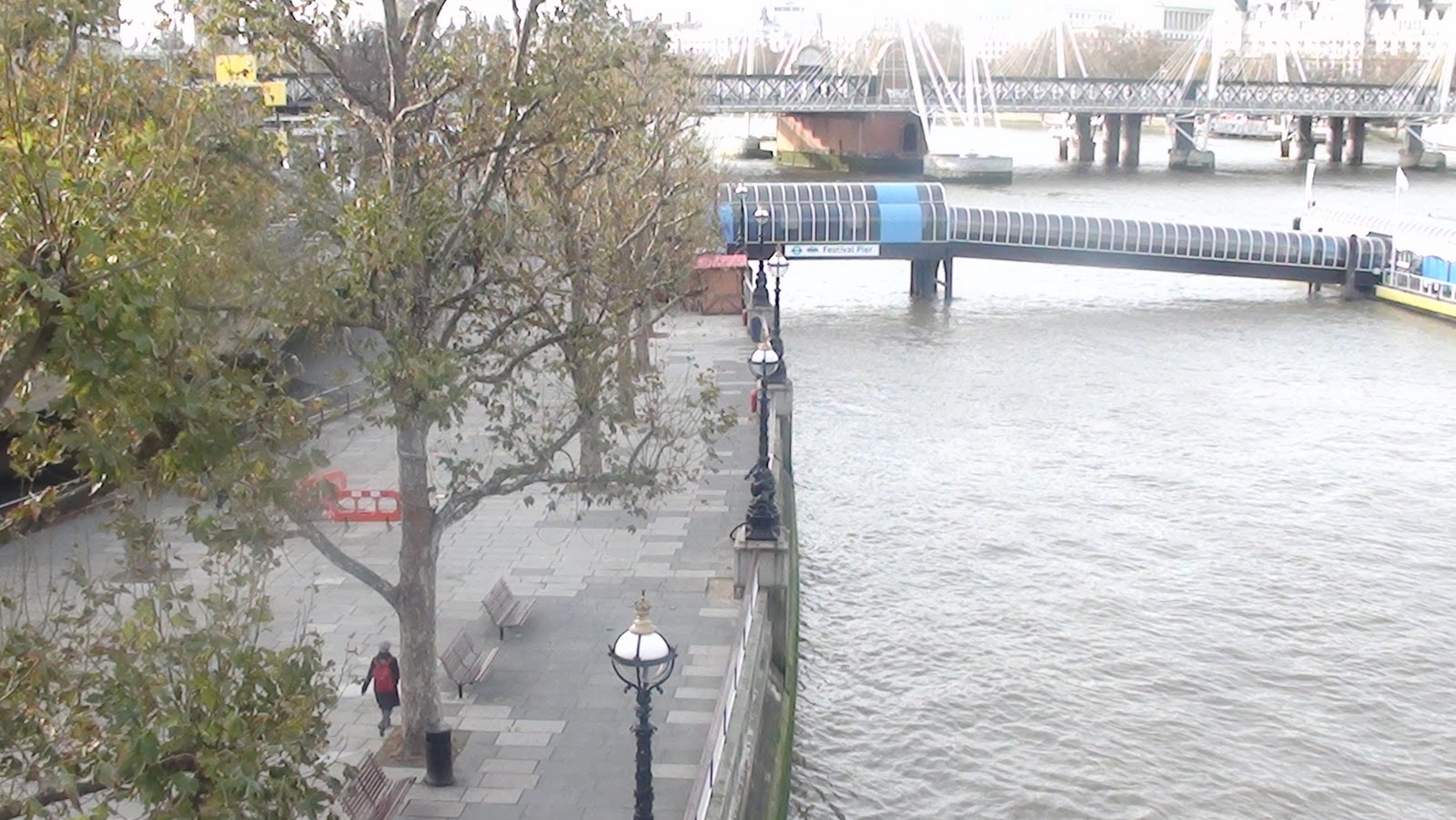
Below is an image of a pathway leading to the London Eye. This is where we will film our artist/actor singing whilst she is walking towards the camera. We chose this location because by having her walking down the middle of the pathway, the audience can focus their attention on just her even if there are other people around. Also if it is dark due to the time of day, it shouldn't be a problem because there are currently christmas lights on the trees which will add to the lighting and it shouldn't be too dark.

Pathway leading towards the London Eye.

Below is an image of Namco station. This is an arcade where we will film the male winning a prize i.e. a teddy bear for the female as a romantic gesture. We chose this location because it is nearby and easy to access. It is also convenient for the scene that we want to shoot. The disadvantages of using inside locations is that we have limited space. This restricts us from moving around the room and filming our music video. Also, if we were inside a location such as a Namco station and the light was also limited, there are no sources of electricity where we can plug in bright lights such as red heads. 

Inside Namco station.

Namco station from outside.

Below is an image of the location where we will film the male and the female sitting down at a restaurant together. We chose this area because it is local and we wont have to travel far in between different places when filming. Also it looks like a nice place where a couple would sit down to eat together. Also If we are shooting in an inside location, we may require permission to shoot our music video and if we aren't given their consent, then we have a dilemma. To avoid this, we have to make sure we come across as polite and always explain to the people who approach us exactly what we are doing and why. If we carry around a letter from our teacher giving us permission, we may be able to avoid getting into any trouble.

Restaurant at South Bank.

Exit via St. Thomas hospital from Waterloo station.

I feel as if these locations are the most suitable as they are typical locations of romance. These are locations where the male would typically take the female out to, maybe to the arcade to win their partner a teddy, to a restaurant to eat or to drop them back home via train and these situations all represent the R&B genre. These locations are all set in South bank, an area in London. Because south bank is a very modern place full of entertainment, this could also represent our artist to be outgoing, fashionable and trendy.

Shot List

Thursday 1 December 2011

Unfinished Version Of Poster

Below is an image of what our final poster will look like. The poster in incomplete at the moment because we havent yet got an image of the actor to put on the front of the poster. However, once we incorporate this, plus a couple of other things such as reviews and star ratings and the record labels logo, the final draft of the poster will be complete and we will present it to our teacher, peers and a wider audience so that we can receive feedback on how it looks. The poster looks different to how we previously wanted it to look, which is due to the fact that we had to change the design of the front cover of the digipak and we wanted to poster to have a similar appearance to the digipak. We have tried to stick to as many convention of a poster as possible when creating the poster on Adobe Photoshop CS3. We included the artists website and social network pages, the artists name in an exquisite font to reflect her star persona, the name of the album in an eye-catching font, the names of other popular songs that will feature on the album, the release date of the album in a font that stands out and where the album will be available to purchase on the day of its release - iTunes.

Final Draft Of The Poster
Without An Image Of The Actor.

Unfinished Version Of Front Cover Of Digipak

Below is an image of the front cover of the digipak that we originally had in mind (without the image of the artist). After creating the front cover on Adobe Photoshop CS3, we asked our teacher and a couple of our friends for feedback on the use of colours, effects and text. In response, we were told that the colour purple didn't look too good for the digipak and that the purple almost made it look like an advertisement for a Cadbury's chocolate bar, which we somewhat agreed with. We were also told that the font looked a little bland and old fashioned, and was advised to change it to something which looked more modern and bold. In terms of the effects used, we were told that the addition of the smoke was very effective as it linked in with the whole theme of the album.

Previous Idea For Front Cover Of Digipak.

Taking all of the advice that was given to us onboard, we decided to make a few simple changes to our digipak including the colour and the text. Below, you can see the processes of producing and developing our digipak.

After Changing The Background Colour
And Adding Both The Lighting Effect And The
Flare Lens Effect.

After Adding The Smoke Effect.

After Adding The Album Name In A More Modern
Font With A Ghost Like Effect.

After Adding 'Conquest Presents' To
The Front Cover Of The Digipak.

Below is an image of what the final front cover for our digipak will look like. The front cover of the digipak will be completed when we incorporate an image of our actor. As you can see, we have listened to the feedback that we had received and we have developed on our previous idea. We decided to lose the purple and make the background for our digipak black. We added a lighting effect onto the black background to make sections of the digipak lighter, giving it a greyish appearance. We also added a flare lens effect to the front cover of our digipak for additional lighting. The primary reason for adding the flare lens effect was so that when we incorporate the image of the actor, the light shining down on the her helps to draw attention to her. It also adds to her star persona making her seem innocent and pure at heart. We also changed the text to a more modern looking one and we spaced the text out. We also added an effect to the text to give it a 'ghost like' appearance. The text fades out vertically from top to bottom. We felt that this would help to make our digipak look more visually exciting for the target audience.

Final Draft Of The Front Cover Of The Digipak
Without An Image Of The Actor.


Weekly Log 1/12/11 - 8/12/11

On Wednesday, we were unable to film due to the fact that our actors were not available on that day. Instead, Kadeem and I went to Southbank to take some recee shots and short videos of our location. This will be uploaded as soon as possible.

Today, Izak will be scanning the audience feedback that we had received in response to our final pitch so that we can upload the images onto the blog. These will help us to develop on our ideas for our music video, digipak and poster.

Kadeem will start creating the digipak and the poster for our artist's album on Adobe Photoshop CS3. However, because we have not yet got an image of our actor to put on the front cover of our digipak or on our poster, he will create an unfinished version which will be complete when we take photos of our actor and incorporate them.

Audience Feedback Sheets

Below are some images of the feedback that we had received from our final pitch. We had scanned these sheets and uploaded them to our blog. These will help us develop on our ideas for our final music video.
  • Good research into conventions.
  • Include pictures, too wordy.
  • Good genre study for digipak, could have more information on the poster.
  • Study more into the costumes.
  • Clear storyboard, with clear pictures.
  • Good organisation of actors with a backup.

  • Clear understanding of conventions.
  • Clearly isn't sure about whether or not they will be subverting or conforming to conventions of R&B.
  • Doesn't know how they are incorporating their conventions.
  • Should include how audience consume media, as well as their hobbies and interest.
  • Good label research.
  • Understand how costume represents artists star persona.

  • Narrative in depth, has a good storyline.
  • Should reduce alpha when editing footage, would be effective.
  • Clear intertextual references.
  • Sounds like a 'BIG' project.
  • Like the idea of spreading the poster through social media.

  • What are the conventions? Which have you used?
  • Include media consumption and target audience's hobbies and interests.
  • Good label research.
  • Clear consideration of costumes and locations - think carefully about make up and style of your artist.
  • Well drawn digipak and poster.
  • Some good ideas but need to experiment with the Ghost & silhouette technique.

  • Good narrative and link to a conventional R&B genre.
  • Good target audience and information about the artist.
  • Good ideas.
  • Need to make sure we have actors who are available.