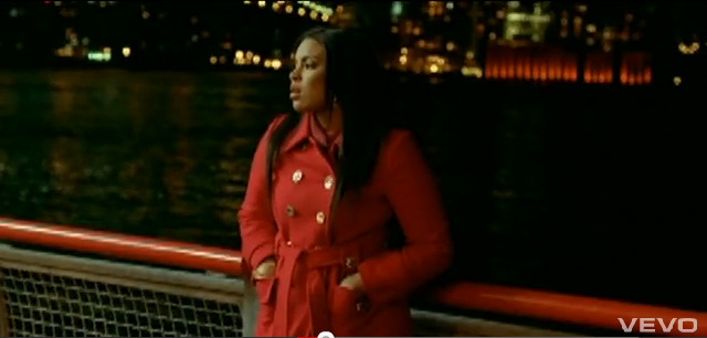
Above is a video containing all of our feedback from our class mates. This will allow us to develop on any ideas that weren't particularly strong according to our audience.
Monday, 28 November 2011
Practice Shots: Opacity Test
Above is a short video of a practice shot which we filmed and edited today. We managed to successfully create the illusion of the person within the shot fading out, to create a 'ghost' like effect. In order to do this, we had to put our camera on a tripod and keep the tripod in the exact same place when filming. I filmed footage with Kadeem in the centre of the shot, and then I filmed the same area but this time, Kadeem stepped out of the shot. I uploaded this footage onto iMovie HD, where I then transferred it onto Final Cut Express. Here, I layered the footage and then added a cross dissolve transition to make the shot with Kadeem in it, gradually fade out into a shot with just the scenery.

Weekly Log 24/11/11 - 1/12/11
This week, me and Kadeem are aiming to get some shooting done for our music video. We have created a schedule and today, we plan to do a practice shot so that we can upload this onto final cut express and experiment with the opacity. Because we have done something similar to this in AS, it should be fairly easy to do. We want to do this because we want to make sure that it will look effective in our real music video, so by practicing it now, we can evaluate the practice shot and decide whether or not to use it in the music video.
Today, Kadeem is gathering some audience feedback from our class mates and he will edit these into one short video for us to upload on our blog. This will be useful because it will help us to develop on some of our ideas that may need improving.
Also, because our school is on strike on Wednesday, we are going to take advantage of this and we are going to try and shoot some footage down in Southbank. We need to double check with our actors that they will be free on this day. If they are not available on the Wednesday, this may prevent us from shooting on the Wednesday.
Wednesday, 23 November 2011


Tuesday, 22 November 2011
Conventions Of R&B Music Video
CINEMATOGRAPHY
In most R&B music videos it is conventional to use many of the following:
- Close Up Shots
- Long Shots
- Mid Shots
 |
| Close Up Shot |
In R&B music videos, close up shots generally encourage a relationship to be developed between the audience and the artist. If we look at the image above which is a close up shot of Jordin Sparks face, we can clearly tell through her facial expressions that she is feeling hopeless, vulnerable and somewhat unloved which may be something that the audience may feel that they can emphasize with. The direct eye contact with the camera may make the audience feel as if Jordin Sparks is sending a message through her song directly to them, which builds up the audience-artist relationship. The close up shot also focuses on the artist's beauty as well as her emotional state, which may be something that males may find attractive, or females may find inspirational.
 |
| Mid Shot |
 |
| Long Shot |
MISE EN SCENE


Thursday, 17 November 2011
Weekly Log 17/11/11 - 24/11/11
This week, Izak will be doing a genre study on the typical codes and conventions of an R&B music video to try and grasp an idea of what types of camera shots, editing techniques and locations are used for a music video. This will help us when it comes to finishing off our storyboard, because it will give us an insight into what micro aspects (i.e. cinematography, editing, mise en scene) we will need to consider to make our music video look high quality and professional. He will also be posting images from other R&B music videos which have influenced our ideas for our music video. He will analyse these photos to explain how these videos have influenced our ideas and he will talk about how we will incorporate these ideas into our music video.
Kadeem will be posting up images of our chosen locations and will analyse them to explain the advantages and disadvantages of these locations. He will also talk about how these locations reflect our artists star persona. He will also be incorporating all of our ideas into a presentation on prezi.com. The presentation will include information about our artist, our track ideas, ideas about our location, props and costumes, primary and secondary target audience for our artist, flat plans of digipak and poster and information about the record label and marketing. We will present these ideas to our class so that we can receive audience feedback. This will help us to develop on our ideas if necessary.
Digipak And Poster Flat Plan And Analysis
 |
| Promo Poster For Our Artist |
Above is an image of the promotional poster for the album titled 'Ghost' by our chosen artist Carla Jaye. When drawing the poster, we took into consideration the typical conventions of a poster and tried to apply as many of these conventions to our poster as possible. In the poster, we made sure that we incorporated typography, including the artists name and the name of the album. We used two different contrasting fonts on the promotional poster.
We used a fancy looking font because this is the type of font often used at a wedding ceremony when the certificate is being signed, and it usually connotes feelings of love and affection, which is reflected in the genre of music on the album which is R&B. The fancy font also draws the audiences attention to the artists name and it is not too overwhelming, neither is it underwhelming. We decided that we wanted the other font to be simple because we wanted to audience to be able to read the information on the poster clearly and we wanted the typography to fade out vertically from top to bottom to represent the album name. The reason we decided to give it this effect is because we didn't want the font to look too boring, however we wanted it to stand out, be informative and be easy for the audience to read at the same time. The white font connotes the innocence of the artist.
We made sure that we included a fairly large image of our chosen artist so that the audience would recognise from a far distance who's album was being promoted on the poster. We also wanted to make sure that there was an image of the artist available for those who were not familiar with the up and coming artist. We have tried to create an image whereby through the composition and the facial expressions of the artist, the audience could see that she is lonely and isolated and that she is a 'hopeless romantic'. Through this representation of her, it is also possible for the audience to predict the genre of music which may be on the album.
We also made sure that we included other conventions such as the artist's website, the release date of the album and other popular songs which will feature on the album. These are all important aspects of a promotional poster, as the website will give the audience an insight in to a little bit about the artist, what she has acheived and what she does, the release date informs the audience about when the album will be available to purchase in stores and online and the list of other popular songs that will feature on the album may entice the audience the buy the album if they have heard and enjoy listening to those particular songs.
We decided to use a two tone palette consisting of a combination of different shades of purples and greys for our poster. The reason we decided to use purple is because purple is quite a mysterious colour often associated with spiritual practices and psychics. This relates to the album name which is 'Ghost' and so we thought that it would be a good idea to choose a colour which compliments the album name.
 |
| Front Cover Of Digipak |
As you can see, we have used the same colour scheme for the digipak so that when it comes to advertising, the poster and the digipak have a similar image. The colour purple also represents leadership, which is further accentuated through her strong composition on the front cover on the digipak. We wanted the image on the front cover to socially influence the primary target audience in particular, because we also wanted to include an element of female empowerment. We wanted to digipak and the poster to compliment each other and we wanted a continuity in design so that if someone has seen the advertisement on the poster and wanted to buy the album, they could identify the album in stores or online easily.
Again, when it came to designing the digipak, we tried to stick to as many conventions of a digipak as possible. We made sure that we had incorporated typography on the front cover of the digipak including the artists name and the name of the album. We used the same fonts as we did on the poster because we wanted to things to be kept consistent when it came to advertising the album. The fonts which we used are similar to those seen on a number of album and digipaks of female R&B artists which we have looked at. We thought that by using two contrasting fonts, the front cover might be slightly more visually appealing.
We made sure that we included an image of the artist on the front cover of the digipak to allow the audience to easily identify the artists album. We used a slightly different image for the front cover of the digipak, one that focuses more on her beauty and composition rather than her emotional state. We did this because we wanted to show that our chosen artist isn't emotional all of the time, and that she can actually be strong at times. We also made sure that we included a message which informs the audience about a couple of popular songs which will feature on the album.
 |
| Back Cover Of Digipak |
We have also included a track listing on the back cover of our digipak. It is important that every digipak has a track list so that the audience can see a list of all of the songs that will feature on the album. We felt that an important aspect of the track list is the order in which the songs come. We have put ten songs on the track list which include: 1) Intro 2) The Script 3) So In Love 4) Ghost 5) DayDreamer 6) Missing You 7) Interlude 8) Anuva Luvr 9)The One 10) All For You. We have also included who these songs have been produced by. We have put these songs in an order which somewhat explain a typical females love life. Intro represents her being exposed to love as a young teen, The Script represents her love life being written out on paper i.e. a diary, So In Love represents her falling deeply in love with her man, Ghost represents her breaking up with her man and seeing him with another female, DayDreamer and Missing You represent her still thinking about her ex, Interlude would be a short song inbetween singing about how she shouldn't be dwelling on her first love, Anuva Luvr represents her finding a new love, The One represents that fact that her new man is definately the one for her and All For You represents everything she does and would do for her new man.
We have also made sure that we have put the artist's own website and social networks sites e.g. Twitter and Facebook on the back cover of the digipak. By having the artists website on the back of the digipak, the audience can freely browse her site to find out more about the artist. In addition, the artists social network sites on the digipak would help to broaden the artists fan base because if people that have purchased the album have Twitter or Facebook, they can follow her or like her fan page and also pass the links to her sites on to their friends for them to follow or 'like' if they please.
On the front panel, we decided that we would include a very short biography just to give the audience a little insight into Carla Jaye's life. The biography will summarise information about Carla Jaye's childhood, how she started off singing, how she became recognised and how she has progressed from then.
For our CD tray compartment, we would like there to be a design or an image behind the clear plastic CD tray to ensure that every compartment of the digipak is visually appealing. Above is an image of the design that we would like to incorporate into our digipak. We will create the design using Adobe Photoshop and we will then stick the transparent CD tray over the top of it.
With the inner panel, we thought that we would insert an image of just the artists hands whilst she is writing one of the songs on the album. We wanted to include this because we wanted to show the audience that Carla Jaye does write songs as well as singing them.
In the other inner panel, we decided that we want to include an image of the artist actually recording one of her songs from the album. We wanted to include this because we also want the audience to see the work that the artist is putting in to making the album.
 |
| Front Panel Of Digipak (Biography) |
 |
| CD Tray Of Digipak |
 |
| First Inner Panel In Digipak |
 |
| Second Inner Panel Of Digipak |
Tuesday, 15 November 2011
Typography For Our Digipak And Poster


The typography is an important aspect of both a digipak and a poster and contributes towards making them look professional and visually appealing. As our music video is based on the genre of R&B, I thought it would be a good idea to look at a digipak from an artist who produces and releases the same genre of music and look at the type of typography used for their digipak and poster. Looking at the above example of Whitney Houston's 'I Look To You' album, the style of font looks very simple but is bold, large and contrasts with the background, making it stand out to the target audience. The font on the poster is the same as the font on the album cover, if not, similar to the font on the album cover but the poster involves more colour, making it look more glamorous and attractive, and drawing in the audiences interest. Below are examples of fonts similar to the ones found in Whitney Houston's digipak and poster.


These are the typical fonts which we would expect to see on the front of R&B album covers. For typical digipaks and posters like Whitney Houston's, the font is mainly aligned to the left or to the right of the digipak and there is usually an image of the artist in the background. This position and boldness of the font allows the audience to see a visual of the artist as well as the font standing out. The colours are also very simple as well which isn't typically attractive. However, the font usually contrasts with the background, making it clearer and easier to see and read.
With our digipak, we want the typography to be simple. We have no intentions to make the font juxtapose with the theme and genre of the song, in fact we want our typography to relate to the concept and the lyrics in our song so that the theme is consistent throughout. Although we want our typography to be simple, we also want it to be unique and effective, so we are going to subvert from using typical fonts and we plan to change the opacity of the font to make it more 'ghost-like'. We plan to do this using Adobe Photoshop. Below are fonts that we may consider using which differ from other R&B fonts.


These fonts above still have elements of the R&B font but are more mysterious and 'ghostly'. I think that these fonts would be most suitable for our digipak. These fonts widen the choices we have to select from as we can choose typical R&B fonts and give them a ghostly effect or we can choose the fonts above without having to add any effects.
Target Audience And Moodboards For Our Artist
 |
| Primary Target Audience Moodboard |
In terms of ethnicity, I don't feel that any specific ethnic group would listen to Carla Jaye's music, the reason I say this is because Carla Jaye is of mixed heritage herself, so I imagine the ethnicity of the target audience would be very diverse ranging from African-Americans, Caucasians, Asians etc.
I believe that the target audience would consist of females mainly from a middle working class family. The reason I say this is because Carla Jaye comes from a middle class family herself and so females from a middle working class family may feel that they can relate to her.
 |
| Secondary Target Audience Moodboard |
Again, I dont think that any specific ethnic group would listen to Carla Jaye's music. Because she is of mixed heritage, I imagine that her secondary target audience would also be very diverse and would include a number of different ethnic groups.
Monday, 14 November 2011
Analysis Of Artists Digipak & Poster And How They Appeal To Target Audience
The image below is of the digipak for Katy Perry's second studio album 'One Of The Boys'. This digipak is an example of a 6 panel digipak which consists of 3 compartments and contains 1 disc which is the CD holding all of the albums contents. I feel that the target audience for this album would predominantly be females in between the ages of 16-35. The reason I say this is because the genre of music is Pop-Rock which can be quite upbeat at times, which is often what the younger generation tend to listen to. The reason I feel that the maximum age of the target audience would be 35 is because the artist is in her late 20's, so females around her age may feel that they can identify with the artist because of the lyrics in the songs, or they just may generally feel that they can identify with her as a person.

 |
| Inside of Katy Perry's 'One Of The Boys' Digipak |
.
The front cover of the digipak for Katy Perry's album 'One Of The Boys' has been designed specifically with the target audience in mind. A wide variety of bright and eye catching colours have been used for the front cover of Katy Perry's digipak to make the album cover visually appealing for the audience and to engage the audience so that they focus the majority of their attention on the digipak cover. A lot of pink has been used on the front cover of the album, which is a colour that is stereotypically represented as a feminine colour, possibly drawing the attention of females to the digipak. The use of many different colours also brings in that element of fun and happiness which is effective because it brings about a good atmosphere, possibly making the individual looking at it feel good.
...

Analysis of Artists Digipak And How It Represents Star Persona And Genre.
The image below is of a digipak of the deluxe edition of the album titled 'Loud' by female R&B artist Rihanna. The digipak consists of 3 compartments and contains 2 discs, one of which is a CD and holds all of the mp3 tracks on the album and one of which is a DVD which is a bonus DVD containing footage of the 'Making of Loud'.

The designers of the front cover of the digipak for Rihanna's album 'Loud' have successfully stuck to the typical conventions of a digipak by putting an image of the artist on the album cover. The key feature that caught my attention was the colour of the Rihanna's hair in the image on the front cover. Her hair is a bright red vibrant colour which is accompanied by her red lipstick accentuating her beauty, and drawing in the viewers attention. The colour red is consistently used as the colour scheme throughout the digipak. Her lively red hair is definitely a primary factor contributing towards her star persona as it makes her unique and different to other artists. It is a different look to what she had when she had released her previous album 'Rated R'. It represents her as energetic and 'full of life' which is further accentuated through the genre of music on the album. This bright and 'loud' shade of red suggests to the audience that the album may contain songs from a specific genre, particularly Pop and Dance, because these genres are often represented by intense and radiant colours, either in the music videos or on the album covers or digipaks. The red lipstick brings in a separate theme of love and seduction which can also suggest that there may be other genres of music on the album such as R&B. The colour of Rihanna's hair also correlates with the floral theme used for the album. The inside of the digipak has an image of the artist laying down in a field of roses, which are most commonly known to be red.

As we can see in the promotional poster of Rihanna's 'Loud' album above, the designers has kept to the colour scheme by sticking with different shades of red to compliment the colour scheme of the digipak. Again, the use of bright and lively colours helps the viewers to grasp an idea of what genre of music may appear on the album. However, the composition of the artist in the image on the poster shows a more elegant, yet seductive side of her personality, in contrast to the energetic and loud side, which can also be used to determine what genre of songs may appear on the album. This can be seen as quite an effective thing because it demonstrates how diverse Rihanna actually is, not just in terms of her personality, but in terms of the genre of songs that she can sing. The more tranquil side of Rihanna is demonstrated through the song 'Caifornia King Bed' which features on the album, the more seductive side is demonstrated through the song 'Skin', which is also on the album and other songs such as 'Only Girl (In The World)' and 'S&M' elicit the lively and wild side of her. The promo poster also includes textual elements as well which is essential in informing the target audience about the release date and the information about the album. The font used in the poster has been kept very simple, which contradicts the idea of the album name which is 'Loud' because the font isn't bold and doesn't draw as much attention. The typography has been positioned at the bottom of the poster. This ensures that the image of Rihanna is still the main focus of the poster, whilst communicating with the audience to give sufficient information.
Thursday, 10 November 2011
Codes And Conventions Of Digipaks And Posters
DIGIPAK
A digipak is a particular type of CD case which is normally made up from a plastic CD tray glued to a folding piece of card, which is used for the front, the spine and the back cover of the digipak. A digipak usually has 3 or 4 compartments which open up to reveal a first compartment on the left, a second compartment in the middle and a final compartments in the right. The typical conventions of a digipak include an image of the artist or band or something relevant to the artist or band i.e. a logo on the front cover, the name of the artist in attractive writing which reflects the genre of music on the album, a track list which can be found either on the back cover of the digipak or on the disc itself, which includes any bonus tracks or footage of behind the scenes, the name of the album on the front cover, the artists website and social network sites e.g. Myspace, Twitter, etc, a barcode on the back cover, the CD and DVD logos, a parental advisory logo if the album contains any explicit language or profanity and information about the production team including the record labels name or logo, the record labels website, the producers names, the songwriters names, copyrights and the year that the album was published.
A digipak is a particular type of CD case which is normally made up from a plastic CD tray glued to a folding piece of card, which is used for the front, the spine and the back cover of the digipak. A digipak usually has 3 or 4 compartments which open up to reveal a first compartment on the left, a second compartment in the middle and a final compartments in the right. The typical conventions of a digipak include an image of the artist or band or something relevant to the artist or band i.e. a logo on the front cover, the name of the artist in attractive writing which reflects the genre of music on the album, a track list which can be found either on the back cover of the digipak or on the disc itself, which includes any bonus tracks or footage of behind the scenes, the name of the album on the front cover, the artists website and social network sites e.g. Myspace, Twitter, etc, a barcode on the back cover, the CD and DVD logos, a parental advisory logo if the album contains any explicit language or profanity and information about the production team including the record labels name or logo, the record labels website, the producers names, the songwriters names, copyrights and the year that the album was published.
 |
| Above Is An Example Of A Digipak With 3 Compartments. |
POSTER
Posters are most commonly used as a form of advertisement for a product, in this case an album or a single. A poster is generally just a sheet of paper with both textual and graphic elements, designed to be posted up on walls or on any other vertical surface to convey a message to people passing by. They are cheap and affordable to manufacture and so it is an easy and effective form of advertising an artist's album. The typical conventions of a poster include an image of the artist covering the majority of the poster, an image of the album cover itself, bright colours which represent the genre of the album or the single, the name of the artist or the band in a font that portrays the genre or artist, the name of the album usually in the same font as the name of the artist or band, the names of the most popular singles on the album, the release date of the album in eye catching font, the record labels logo and website, the artists or bands social network links e.g. Myspace, Twitter, Facebook fan page, etc and a place where you can buy the album. Some promo posters may contain other features, such as an age certificate or a parental advisory logo in the music on the album contains explicit language, reviews of the album and star ratings from magazines and newspapers and sometimes the price is printed on the poster.
 |
| Above Is An Example Of A Poster Advertising The Release Of UK Artist Jessie J's Album Titled 'Who You Are'. |
Genre Study: Codes And Conventions Of Relevant Genre To Music Digipak
The song that we have decided to use for the production of our music video is a song called 'Ghost' by a young female artist called Carla Jaye who specialises in the Indie/R&B genre and also sings covers songs by artists such as Stevie Wonder who specialise in the Soul genre. As a part of our final project, we will be required to create a digipak for our chosen artist. In order to get an idea of what the digipak for a female R&B artist should look like, we have looked at a number of album covers of artists such as Keri Hilson, Jennifer Hudson, Adele, Rihanna, Beyonce, etc. The vast majority of female artists digipaks and albums contain an image of the artist themselves on the front cover. The image on the front of the digipak is commonly selected to match the genre of the music on the album.

The typical conventions of the front cover of a female R&B artists digipak includes:
- An image of the artist or of a relevant logo on the front cover (Usually a close up or a mid shot).
- The artist is usually making direct eye contact with the audience, enticing the audience to focus their attention on the artwork of the digipak.
- The artists name in a font which stands out to the target audience.
- The name of the album in the same, or a similar font which reflects the genre of music on the album.
- Parental advisory logo if the album contains songs with explicit lyrics.
 |
| Adele - 21 |
 |
| Beyonce - 4 |
 |
| Keri Hilson - In A Perfect World |
Track Clearence For Carla Jayes 'Ghost'


The Conquest team replied back to my email a couple hours later, giving me and Izak the permission to use their song but addressed clearly that they do not want us to leak it or for us to post it on worldwide sites because people could download the mp3 version and leak the song.
Weekly Log 10/11/11 -17/11/11
Izak is currently analysing various digipaks which are similar to the idea of our digipak. Because the song we chose is a R&B song, Izak's role is to research similar digipaks from R&B artists such as Rihanna, Beyonce, Adele, Katy Perry etc. This research will help us with our digipak as we can generalise the conventions from each digipak researched and this will give us ideas with ours.
My role (Kadeem) is to start creating the digipak from scratch on Adobe Photoshop CS3. From the research that Izak has done, I can start creating the 6 compartments of the digipak and give it a typical R&B look. I also need to create a poster to go along with our digipak. I would like the poster and the digipak to be simple and effective, which is typical for a R&B digipak.
Subscribe to:
Comments (Atom)