|
| Promo Poster For Our Artist |
Above is an image of the promotional poster for the album titled 'Ghost' by our chosen artist Carla Jaye. When drawing the poster, we took into consideration the typical conventions of a poster and tried to apply as many of these conventions to our poster as possible. In the poster, we made sure that we incorporated typography, including the artists name and the name of the album. We used two different contrasting fonts on the promotional poster.
We used a fancy looking font because this is the type of font often used at a wedding ceremony when the certificate is being signed, and it usually connotes feelings of love and affection, which is reflected in the genre of music on the album which is R&B. The fancy font also draws the audiences attention to the artists name and it is not too overwhelming, neither is it underwhelming. We decided that we wanted the other font to be simple because we wanted to audience to be able to read the information on the poster clearly and we wanted the typography to fade out vertically from top to bottom to represent the album name. The reason we decided to give it this effect is because we didn't want the font to look too boring, however we wanted it to stand out, be informative and be easy for the audience to read at the same time. The white font connotes the innocence of the artist.
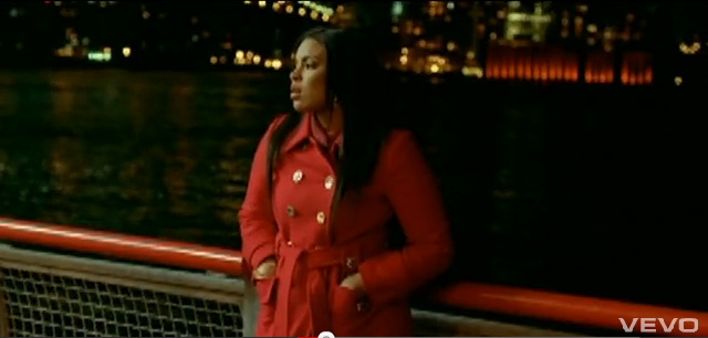
We made sure that we included a fairly large image of our chosen artist so that the audience would recognise from a far distance who's album was being promoted on the poster. We also wanted to make sure that there was an image of the artist available for those who were not familiar with the up and coming artist. We have tried to create an image whereby through the composition and the facial expressions of the artist, the audience could see that she is lonely and isolated and that she is a 'hopeless romantic'. Through this representation of her, it is also possible for the audience to predict the genre of music which may be on the album.
We also made sure that we included other conventions such as the artist's website, the release date of the album and other popular songs which will feature on the album. These are all important aspects of a promotional poster, as the website will give the audience an insight in to a little bit about the artist, what she has acheived and what she does, the release date informs the audience about when the album will be available to purchase in stores and online and the list of other popular songs that will feature on the album may entice the audience the buy the album if they have heard and enjoy listening to those particular songs.
We decided to use a two tone palette consisting of a combination of different shades of purples and greys for our poster. The reason we decided to use purple is because purple is quite a mysterious colour often associated with spiritual practices and psychics. This relates to the album name which is 'Ghost' and so we thought that it would be a good idea to choose a colour which compliments the album name.
 |
| Front Cover Of Digipak |
As you can see, we have used the same colour scheme for the digipak so that when it comes to advertising, the poster and the digipak have a similar image. The colour purple also represents leadership, which is further accentuated through her strong composition on the front cover on the digipak. We wanted the image on the front cover to socially influence the primary target audience in particular, because we also wanted to include an element of female empowerment. We wanted to digipak and the poster to compliment each other and we wanted a continuity in design so that if someone has seen the advertisement on the poster and wanted to buy the album, they could identify the album in stores or online easily.
Again, when it came to designing the digipak, we tried to stick to as many conventions of a digipak as possible. We made sure that we had incorporated typography on the front cover of the digipak including the artists name and the name of the album. We used the same fonts as we did on the poster because we wanted to things to be kept consistent when it came to advertising the album. The fonts which we used are similar to those seen on a number of album and digipaks of female R&B artists which we have looked at. We thought that by using two contrasting fonts, the front cover might be slightly more visually appealing.
We made sure that we included an image of the artist on the front cover of the digipak to allow the audience to easily identify the artists album. We used a slightly different image for the front cover of the digipak, one that focuses more on her beauty and composition rather than her emotional state. We did this because we wanted to show that our chosen artist isn't emotional all of the time, and that she can actually be strong at times. We also made sure that we included a message which informs the audience about a couple of popular songs which will feature on the album.
 |
| Back Cover Of Digipak |
On the back cover of the digipak, we have incorporated a number of conventions including an area in which information about the production team will be. This information will include the record labels name and logo, the names of the songwriters, the record labels website, the copyrights logo and the year that the album was published. This is important in recognising who has taken credit for what and the copyrights logo ensures that no one can take any content from the album and claim it as their own. We have also put a barcode on the back of the digipak so that it can be scanned when it is being purchased in stores.
We have also included a track listing on the back cover of our digipak. It is important that every digipak has a track list so that the audience can see a list of all of the songs that will feature on the album. We felt that an important aspect of the track list is the order in which the songs come. We have put ten songs on the track list which include: 1) Intro 2) The Script 3) So In Love 4) Ghost 5) DayDreamer 6) Missing You 7) Interlude 8) Anuva Luvr 9)The One 10) All For You. We have also included who these songs have been produced by. We have put these songs in an order which somewhat explain a typical females love life. Intro represents her being exposed to love as a young teen, The Script represents her love life being written out on paper i.e. a diary, So In Love represents her falling deeply in love with her man, Ghost represents her breaking up with her man and seeing him with another female, DayDreamer and Missing You represent her still thinking about her ex, Interlude would be a short song inbetween singing about how she shouldn't be dwelling on her first love, Anuva Luvr represents her finding a new love, The One represents that fact that her new man is definately the one for her and All For You represents everything she does and would do for her new man.
We have also made sure that we have put the artist's own website and social networks sites e.g. Twitter and Facebook on the back cover of the digipak. By having the artists website on the back of the digipak, the audience can freely browse her site to find out more about the artist. In addition, the artists social network sites on the digipak would help to broaden the artists fan base because if people that have purchased the album have Twitter or Facebook, they can follow her or like her fan page and also pass the links to her sites on to their friends for them to follow or 'like' if they please.
 |
| Front Panel Of Digipak (Biography) |
On the front panel, we decided that we would include a very short biography just to give the audience a little insight into Carla Jaye's life. The biography will summarise information about Carla Jaye's childhood, how she started off singing, how she became recognised and how she has progressed from then.
 |
| CD Tray Of Digipak |
For our CD tray compartment, we would like there to be a design or an image behind the clear plastic CD tray to ensure that every compartment of the digipak is visually appealing. Above is an image of the design that we would like to incorporate into our digipak. We will create the design using Adobe Photoshop and we will then stick the transparent CD tray over the top of it.
 |
| First Inner Panel In Digipak |
With the inner panel, we thought that we would insert an image of just the artists hands whilst she is writing one of the songs on the album. We wanted to include this because we wanted to show the audience that Carla Jaye does write songs as well as singing them.
 |
| Second Inner Panel Of Digipak |
In the other inner panel, we decided that we want to include an image of the artist actually recording one of her songs from the album. We wanted to include this because we also want the audience to see the work that the artist is putting in to making the album.